Always loved Cindy Lauper and the energy of her songs (snif). Well, stop wining and get into the heart of what I would really like to show you: a bit of time analysis and decomposition.
NOTE: what will follow could be applied to ANY signal or signal combo. Even applied to custom signals related to database growth, for example. All queries can be downloaded here https://github.com/duiliotacconi/DT.Telemetry/tree/main/TIME%20SERIES%20ANALYSIS
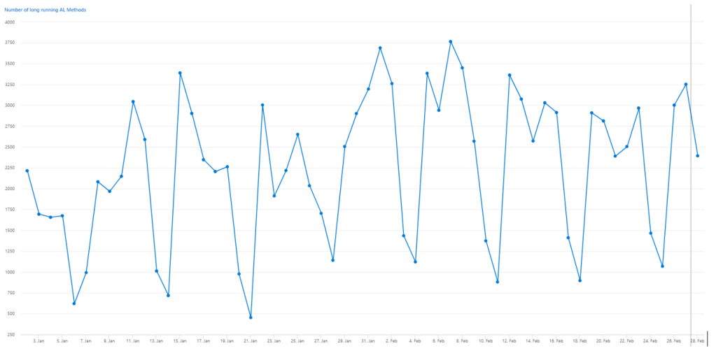
Let’s consider a standard example: the number of Long Running AL Methods (aka LRAM). See below a typical column chart that counts the number of long running queries per day within a time range.

To move forward in the time analysis, simply change the column chart with the typical time chart. Same data, different chart. All good.
The questions that you might have about this timeline could be
- Is it getting better or worse? How much better / worse?
- How could be the graph shape in the future?
- Are there any outliers?
- Are there common patterns or is this scattered?
TREND
I bet that it is hard from that graph to understand if this is going better or worse. To objectively answer this question, there is a specific statistical function commonly used in predictive analysis: linear regression.
Simply transforming KQL result into a series and applies series_fit_line() – Azure Data Explorer & Real-Time Analytics | Microsoft Learn and magically it appears your trend.
let _entraTenantId = '<yourEntraTenantId>';
let _environmentType = '<yourEnvironmentType>';
let _environmentName = '<yourEnvironmentName>';
let _startTime_Ingestion = datetime(2024-01-02T00:13:00Z);  //Change it with your values
let _endTime_ingestion = datetime(2024-02-27T23:59:00Z);    //Change it with your values
let LRAM = (traces
//Include only 8 to 17 UTC - Change it with your woking hours or wipe these 2 lines out to consider 24h
| where timestamp between (_startTime_Ingestion .. _endTime_ingestion)
| where customDimensions.aadTenantId has_any (_entraTenantId)
| where customDimensions.environmentType has_any (_environmentType)
| where customDimensions.environmentName has_any (_environmentName)
| where customDimensions.eventId == 'RT0018'
| extend hour = hourofday(timestamp)
| where hour between (8 .. 17)
);
let _interval = 1d;
let _serieStartTime = datetime(2024-01-02); //Change it with the same date as ingestion start time
let _serieEndTime = datetime(2024-02-27);   //Change it with the same date as ingestion end time
LRAM
| make-series Count = count() on timestamp from _serieStartTime to _serieEndTime step _interval
| extend (RSquare, Slope, Variance, RVariance, Interception, LineFit)=series_fit_line(Count)
| render timechart with(title='Long Running AL Methods : TREND')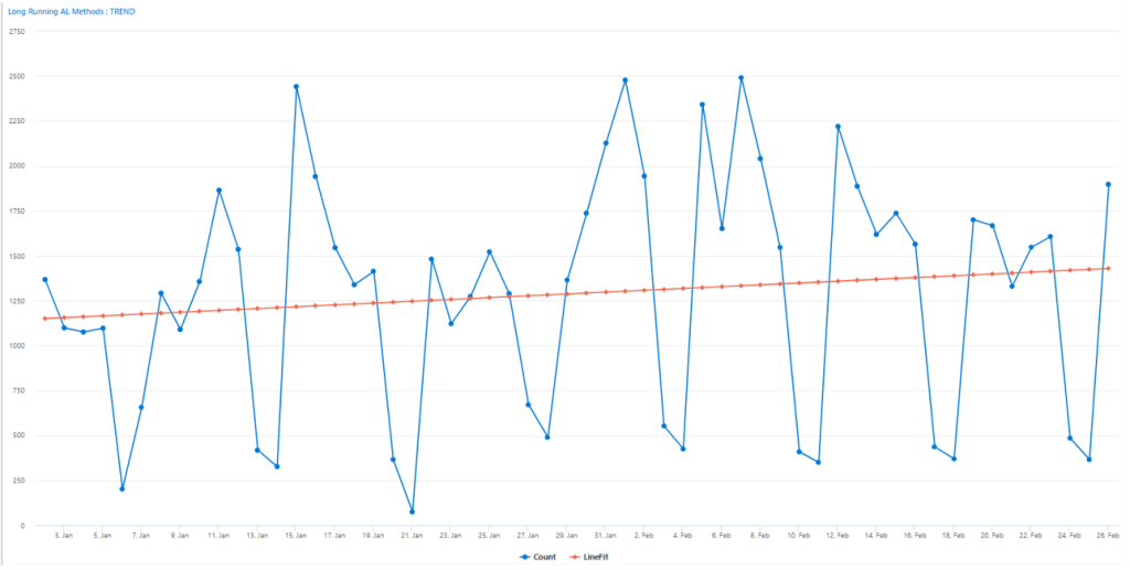
In the tabular output, you also have the relevant parameters:

And to answer the first question. Yes, it is slowly degrading.
Just a small note, linear regression works better with linear values and could provide tight insights. With sinusoid signals, I – personally – take it just as a compass to understand the direction (increasing/decreasing) and its slope.
FORECAST
If linear regression is just a compass, then other fitting functions might be more representatives.
Adopting decomposition with series_decompose_forecast() – Azure Data Explorer & Real-Time Analytics | Microsoft Learn, it is possible to create a function that could simulate and fit within the current behavior and considering that function, determine how it could be the shape and single value count in the next N days (in this example: 1 week).
let _entraTenantId = '<yourEntraTenantId>';
let _environmentType = '<yourEnvironmentType>';
let _environmentName = '<yourEnvironmentName>';
let _startTime_Ingestion = datetime(2024-01-02T00:13:00Z);  //Change it with your values
let _endTime_ingestion = datetime(2024-02-27T23:59:00Z);    //Change it with your values
let LRAM = (traces
//Include only 8 to 17 UTC - Change it with your woking hours or wipe these 2 lines out to consider 24h
| where timestamp between (_startTime_Ingestion .. _endTime_ingestion)
| where customDimensions.aadTenantId has_any (_entraTenantId)
| where customDimensions.environmentType has_any (_environmentType)
| where customDimensions.environmentName has_any (_environmentName)
| where customDimensions.eventId == 'RT0018'
| extend hour = hourofday(timestamp)
| where hour between (8 .. 17)
);
let _interval = 1d;
let _serieStartTime = datetime(2024-01-02); //Change it with the same date as ingestion start time
let _serieEndTime = datetime(2024-03-06);   //Change it with the same date as ingestion end time + 7 days to forecast
LRAM
| make-series Count = count() on timestamp from _serieStartTime to _serieEndTime step _interval
| extend Forecasted = series_decompose_forecast(Count, 7, -1)  // forecast one week forward
| render timechart with(title='Long Running AL Methods: FORECAST')
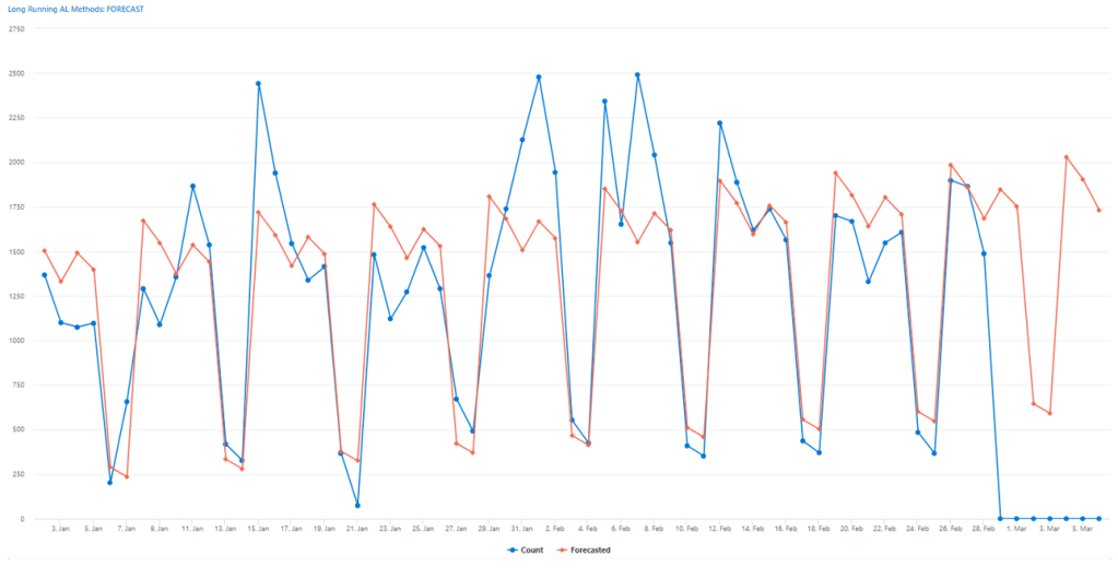
So, now, this is what you could expect in the first week of march 2024 from this environment about LRAM count.
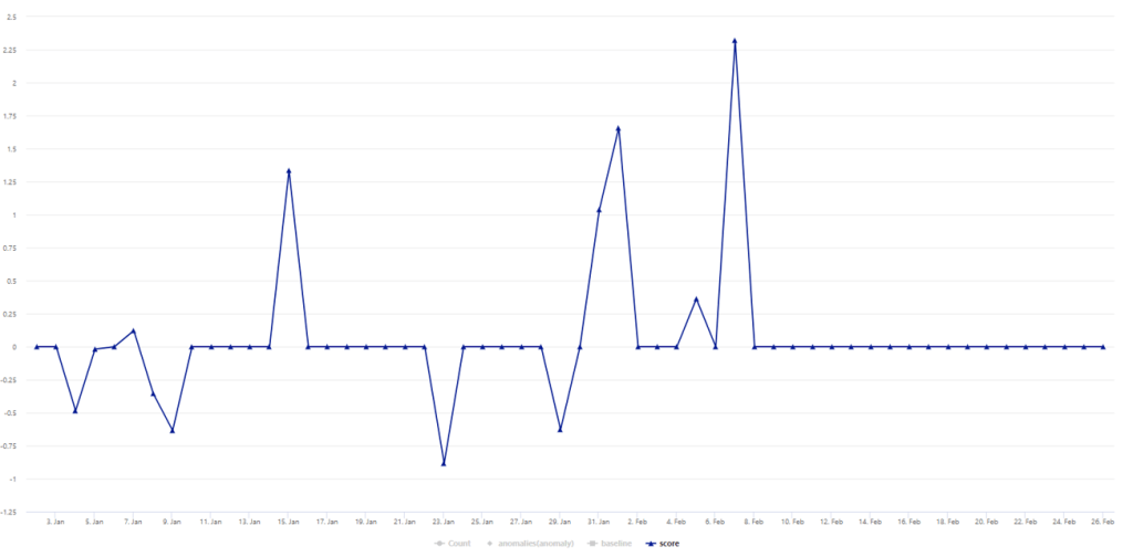
ANOMALY DETECTION
Decomposition, is also very helpful in determining anomalies, considering a specific base fitting function. This is easy as 1, 2, 3. Apply series_decompose_anomalies() – Azure Data Explorer & Real-Time Analytics | Microsoft Learn to spot out outliers (anomalies) and how far are these outliers from the fitting function (score).
let _entraTenantId = '<yourEntraTenantId>';
let _environmentType = '<yourEnvironmentType>';
let _environmentName = '<yourEnvironmentName>';
let _startTime_Ingestion = datetime(2024-01-02T00:13:00Z);  //Change it with your values
let _endTime_ingestion = datetime(2024-02-27T23:59:00Z);    //Change it with your values
let LRAM = (traces
//Include only 8 to 17 UTC - Change it with your woking hours or wipe these 2 lines out to consider 24h
| where timestamp between (_startTime_Ingestion .. _endTime_ingestion)
| where customDimensions.aadTenantId has_any (_entraTenantId)
| where customDimensions.environmentType has_any (_environmentType)
| where customDimensions.environmentName has_any (_environmentName)
| where customDimensions.eventId == 'RT0018'
| extend hour = hourofday(timestamp)
| where hour between (8 .. 17)
);
let _interval = 1d;
let _serieStartTime = datetime(2024-01-02); //Change it with the same date as ingestion start time
let _serieEndTime = datetime(2024-02-27);   //Change it with the same date as ingestion end time
LRAM
| make-series Count = count() on timestamp from _serieStartTime to _serieEndTime step _interval
| extend (anomalies, score, baseline) = series_decompose_anomalies(Count, 1.0, -1, 'linefit')
| render anomalychart with(anomalycolumns=anomalies, title='Long Running AL Methods: ANOMALIES')

By removing Count, baseline and score, you could clearly see the bold points in the series chart. These were the “special” days where something happened with more (or less) frequency. For example, running a special long running report during the day (intended or not, it is not matter of question here).

And if you look tightly at the score, you can see it spans, in this case, from -1 to 2.25. This represents how far are outliers from the fitting function. The highest score they have, in absolute terms, the more they are considered as spot events (or anomalies).
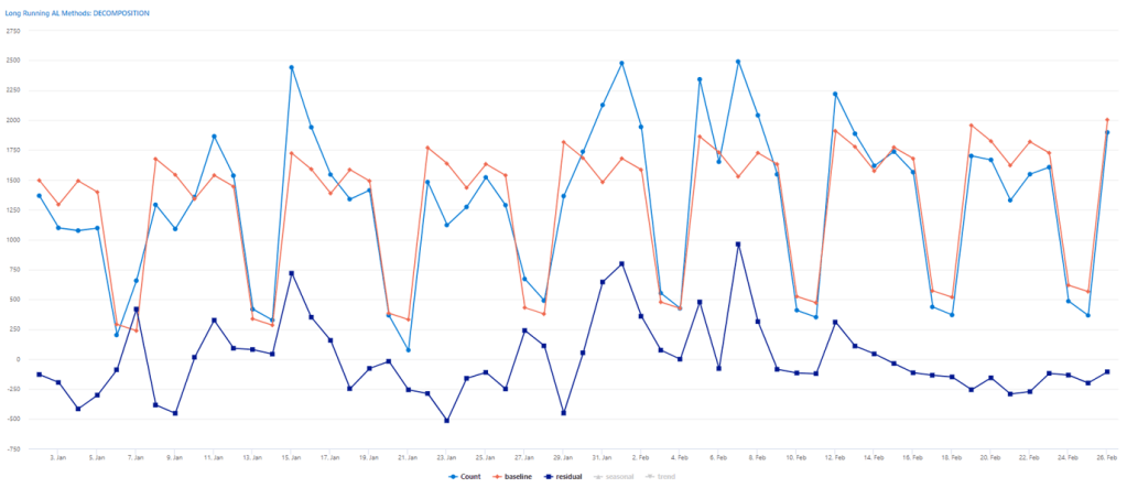
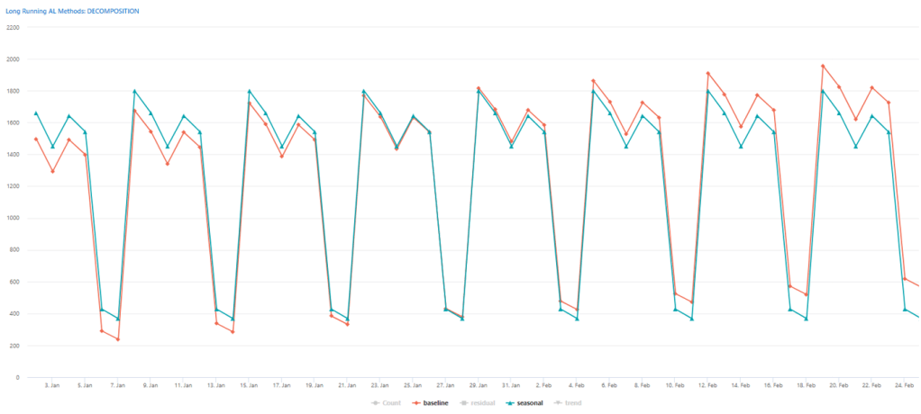
DECOMPOSITION
Save the best for last.
If you want to know if there is a common pattern (seasonality) and how good the model fits into a function then just throw your series into the series_decompose() – Azure Data Explorer & Real-Time Analytics | Microsoft Learn
let _entraTenantId = '<yourEntraTenantId>';
let _environmentType = '<yourEnvironmentType>';
let _environmentName = '<yourEnvironmentName>';
let _startTime_Ingestion = datetime(2024-01-02T00:13:00Z);  //Change it with your values
let _endTime_ingestion = datetime(2024-02-27T23:59:00Z);    //Change it with your values
let LRAM = (traces
//Include only 8 to 17 UTC - Change it with your woking hours or wipe these 2 lines out to consider 24h
| where timestamp between (_startTime_Ingestion .. _endTime_ingestion)
| where customDimensions.aadTenantId has_any (_entraTenantId)
| where customDimensions.environmentType has_any (_environmentType)
| where customDimensions.environmentName has_any (_environmentName)
| where customDimensions.eventId == 'RT0018'
| extend hour = hourofday(timestamp)
| where hour between (8 .. 17)
);
let _interval = 1d;
let _serieStartTime = datetime(2024-01-02); //Change it with the same date as ingestion start time
let _serieEndTime = datetime(2024-02-27);   //Change it with the same date as ingestion end time
LRAM
| make-series Count = count() on timestamp from _serieStartTime to _serieEndTime step _interval
| extend (baseline, seasonal, trend, residual) = series_decompose(Count, -1, 'linefit')  //  decomposition of a set of time series to seasonal, trend, residual, and baseline (seasonal+trend)
| render timechart with(title='LRAM Decomposition')
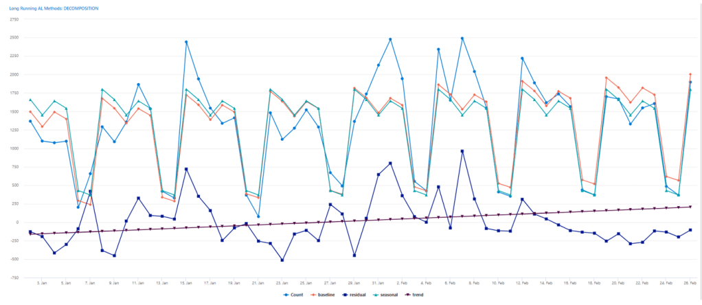
And you will get a baseline function that added to its residual value, will give you exactly the perfect fit.
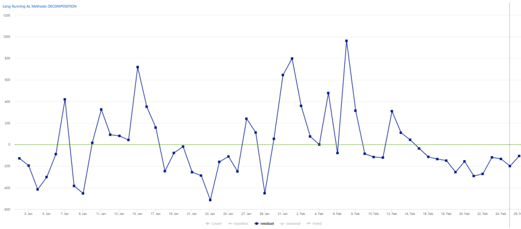
See below only the residual part. Notice the last tail of the residual part that represents a higher stability in the predictive analysis, compared to e.g. 29th January to 9th February.
NOTE: I have added a green reference line at value 0, for better visibility.
Last comment on decomposition: seasonality vs fitting function. Seasonality will be determined considering period buckets while fitting function, aka baseline, will include also the trend. You could spot the difference between the two below. Seasonality tends to have a very thin variation while fitting function is more following the linear regression slope.
Now I know that you have a lot of graphs in your dashboard(s). Maybe worth giving this a shot?
If you have tried one or more of these statistical functions and had just a bit of fun with it like I did – at least -, I want you to know that I am super happy.
And remember that:
If you’re lost, you can look and you will find (tele)me(try)
Time after time
If you fall, I will catch you, I’ll be waiting
Time after time
(To my wife, that is silently waiting for me to come back to bed… I love you darling)

Leave a comment