To Shane MacGowan R.I.P.
Together with the AI hype, the new Analysis Mode introduced with Dynamics 365 Business Central 2023 Wave 1 (22.x) and enhanced with 2023 Wave 2 (23.x) is something that would impressively make the difference in the upcoming years.
But what is this new component under the hood?
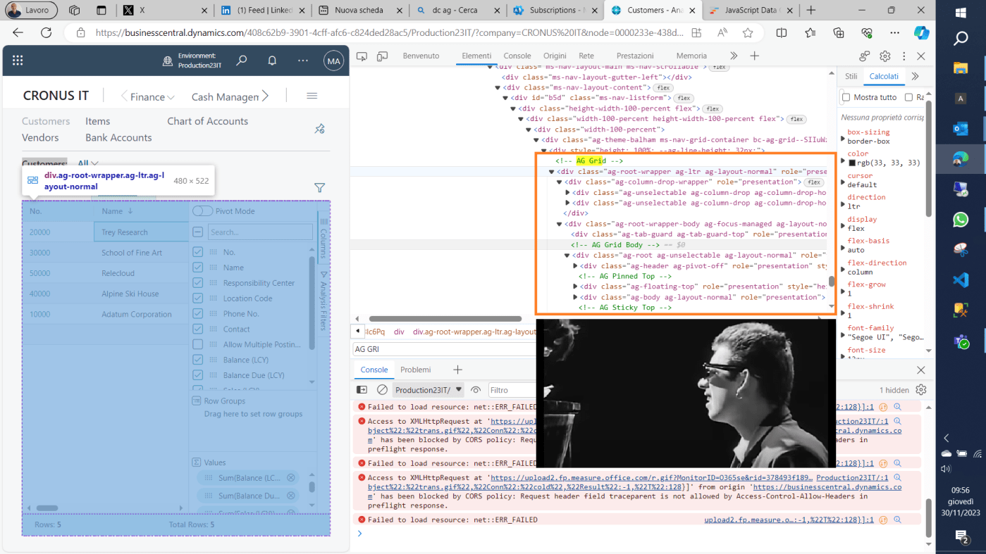
Well, don’t tell anybody such “Pulcinella’s secret” (something that should be a secret but everybody knows about it). If you press F12 on your browser, you will find out all these references to AG Grid

Proclaimed as “The Best JavaScript Grid in the world”, you could visit the official website:
And spot out that it is used and trusted by developers at 9 out of 10 Fortune 500 companies, NASA included.

If you take a tour inside this site, you might spot out all the potential implementations that Dynamics 365 Business Central could benefit from that are already available with this product.
Take the guided tour here React Data Grid – YouTube
Meanwhile you are dreaming about what could have been added more to let analysis mode be more sexy, I share with you all mine.
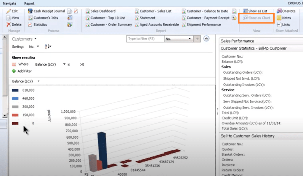
- Charts. AG Grid offers an integrated chart experience already out-of-the-box (“the best JavaScript Charts in the world” – obviously -), that is not implemented within Dynamics 365 Business Central. I know that Power BI strategy could be in collision with this charting tool and experience, but if I must dream, better dream big. Looking at it, this could be somewhat similar to the return of the old Windows Client “Show As Chart” functionality. And AG Grid has a lot of interesting functionalities such as animation, zoom and others.
- Colorization. I have already asked that in the latest Business Central Launch Event – Oct 10 | RingCentral Events (hopin.com) . I fully understand that product brand and color must be respected, what I would love is to give more joy to eyes implementing the same or similar AL style page property behavior (with Blue, Green, Italic, Bold etc.).
- Row Group. A grouping tree can be achieved easily by dragging and dropping one or more fields into a header section (you can see it in the official AG GRID video) but this is not part of the current implementation with Dynamics 365 Business Central). This could be a super easy way to create grouping and subgrouping to be exported in Excel for further analysis.
- Export in Excel. The current export in Excel functionality offered, does not generate a good-looking output most of the time and it is annoying to expand all groups to have all lines exported. It needs a bit more maquillage to be productive. Compared to the standard Open in Excel functionality within Dynamics 365 Business Central, this export in excel is few steps behind it.
- Analysis Mode added also when inspecting ?table= content. Inspecting table content in a read-only way has been done by anyone, no matter if you are consultant or developer, to check data quality by adding ?table=TableNo to the endpoint URL. For some or most of them, you might end up in selecting all the lines and paste it into excel (yes, there is no open in excel button there) typically for grouping purposes. What great would it be to have it enabled also when running that functionality? First example: Table Information – to check data size… And how cool it could be with a treemap chart?
Over and out.

Leave a comment