
Let’s consider pageViews average duration an indicator of good / bad performance within UI. Is this reliable as stand-alone single indicator?
NO
Take this example. Let’s say that users open a Sales Order 100 times. 50 times it opens in 0.5 seconds, 50 times it opens in 5 seconds.
50 * 0.5 = 25
50 * 5 = 250
Average Duration = (25 + 250) / 100 = 2.75 sec
You might think that this is acceptable. It is not. You have 50% chances to wait 5 seconds before the page opens and 2.75 will not represents the current experience.
The average duration, then, is just a very raw indication. What you consider then? I know what you think: min and max. MMMM… Not a good idea.
Consider yet another dummy example. Let’s say that 22 times Sales Order opens in 0.5 sec, 25 times it opens in 1 sec, 25 times it opens in 3 sec and, for whatever reason, there are 3 spikes of 20 seconds.
22 * 0.5 = 11 sec
25 * 1 = 25 sec
25 * 3 = 75 sec
3 * 20 = 60 sec
Average duration = (11 + 25 + 75 + 60) / 75 = 2.28 sec
In reality, you have 63% of probability of opening the Sales Order in 0.5 / 1 second. But if you look at the range this is quite wide and spans between 0.5 seconds to 20 seconds that hardly represents the statistical dispersion and the goodness of the average as measure. Min and Max are quite poor in descripting the distribution.
There it comes the standard deviation.
Considering a normal curve – the Gaussian shape – the standard deviation represents how data tend to be distributed within that shape. The lower it is, the more the average value – in our case the duration – represents what users should expect in the next iteration.
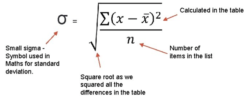
Put it into simple words, in this context, the standard deviation represents the stability of the average duration and the probabilities (68%, to be precise) to have a value within the standard deviation range (+ / -) the next time a user will open that specific page.

Let’s take an example with a real SaaS case with post-upgrade from 22.5 to 23.1. The term post-upgrade means many things: a different cluster where to connect to, different table extension data model, different platform, different 1st, and 3rd party extensions, and so on and so forth.
How to measure, then, if you have better UI performance AND stability (or a rollercoaster)?
The solution is to compare both average duration AND standard deviation.
I have prepared a simple PRE / POST update KQL sample here.
DT.Telemetry/STDDEV at main · duiliotacconi/DT.Telemetry (github.com)
The relevant code part is to
- Filter out useless page elements.
| where customDimensions.pageType !in (“ReportPreview”,”ReportProcessingOnly”,”XmlPort”,”FilterPage”,”StandardDialog”,”ConfirmationDialog”)
- Consider only objects that has been logged at least 150 times post upgrade.
| where [‘Count POST’] > 150
- Consider only objects that have an average at least higher or equal to 1.5secs, post-upgrade.
| where [‘Avg. Time POST’] > 1500
And the result is: 58 records. Below an output snippet

In this way, I could spot out both highlights and lowlights in the UI responsiveness.
Considering this example, simply export into Excel the list and color the negative values in red for both Average Time and Standard Deviation Deltas. Some fact sheet:
Average Duration
- 37 lines out of 58 (64%) had an increase in performance, on average.
- Increase in performance spans from 10ms to 4sec, on average.
- 21 lines (36%) had a decrease in performance, on average.
- Decrease in performance spans from 20ms to 1sec, on average.
Standard Deviation
- 43 lines out of 58 (74%) had a decrease in standard deviation.
- Decrease in standard deviation spans from 20ms to 5sec.
- 15 lines out of 62 (26%) had an increase in standard deviation.
- Decrease in standard deviation spans from 100ms to 3sec.
Highlights:
Top 3 in duration delta

Top 3 in standard deviation delta

Lowlights:
Top 3 in duration delta

Item Card has been decreased of about 1sec and have more rollercoaster effect. But the other two can be considered the same: +300ms with the same standard deviation. Status: go deeper in the Item Card analysis.
Top 3 in standard deviation delta

In this case, average duration is roughly the same, but values are scattered with a higher standard deviation. They might need a bit deeper analysis and a double check where this delta is coming from or waiting for more data (like in the case of Posted Purchase Receipt). Status: just keep them monitored.
CONCLUSION
Upgrading to 23.1 gave to this environment not only a boost in UI performance but also objectively a better stability.
Relative UI stability, between two updates, could be measured through standard deviation and their deltas, considering a discrete number of values. The lower is the standard deviation, the better is UI stability and the average duration is representative of its value distribution.
You could secure objectively the effectiveness of the increased / decreased UI performance post upgrade. It is trivial to say that, in this case, we must work out the few lowlights. But these are peanuts, compared to the previous performance situation.
Bottom line. I have voluntarily omitted ONE line: Page Inspection. I did this because page inspection is more a platform thingy than an operative one.

This has a known minor bug in performance in v23 that should be resolved soon by Microsoft (it should be fixed with 23.3 January update). As you can see, the average time moved from 1 second to 3 seconds. You might say this is still acceptable. Hell, No! Standard Deviation moved from less than 1 second to 9 seconds. Welcome to the Rollercoaster baby !!!
