
Telemetry and Lego have many things in common.
Both could be collected. And telemetry logs are way cheaper than Lego bricks. If you got kids and it is Xmas time, you perfectly got what I mean.
Now imagine that you have thousands of these Lego components flushed into a big bucket and you must build up something with them. That is the best way to think of telemetry.
The more time you practice, the best it is your final build output. And every day you start again from scratch. Again, and again with something new. Practice and experience are what will make you a great Lego builder (together with a bit of fantasia, of course).
And when a new type of Lego brick kicks in (a new telemetry signal), it will enrich your final output even more. Or when you find out another way to reorganize your bricks.
I’m gonna pick up the pieces
And build a LEGO house
If things go wrong, we can knock it down.
I’ll try here to provide you with a couple of my best bricks to build up an easy way to spot out regression or performance trends. To enrich your Lego house.
Performance is typically associated with a dynamic process that starts with an objective numeric baseline and progress in time with positive or negative deviation from that baseline. – Wow! I have resumed years of pages of dissertation about performance into few lines (so proud of me). –
Being more concrete and apply this to Dynamics 365 Business Central signals, you have typically 2 signals that are super helpful in spot out regression or trends in performance (the long-running-something ones):
- RT0005 Long Running SQL Statement
- RT0018 Long Running AL Statement
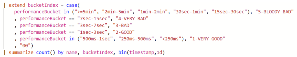
To KISS (Keep It Simple Stupid), we monitor the following custom dimensions:
- Count of signals received in time bins.
- Average Duration of signals received in time bins.
It is trivial to say that what will follow could be implemented to any signal (e.g. Report Generation, etc.) and enriched on more custom dimensions (e.g. SQL Rows Read, SQL Execute, etc.). Remember? Lego bricks and fantasia (yes fantasia = Italian fantasy. Believe me, it is different) …
You can find both queries for RT0005 and RT0018 in this GitHub repo: DT.Telemetry/PIVOT at main · duiliotacconi/DT.Telemetry (github.com)
Basically, this is a join of both count and average together and for each of these two, the tricky part is the evaluate pivot statement:

Based on the start to end date, you will have a timeline progression for every long running SQL or AL statement, like the one shown below:
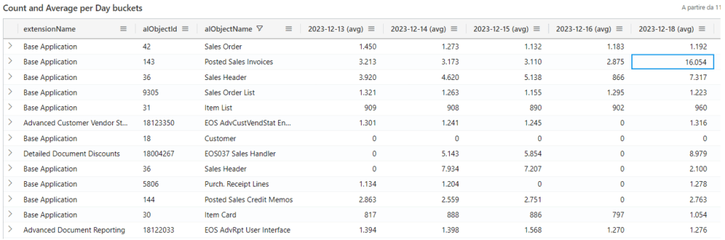
And this is the first part of the Lego house we are building. If you look at these number before and after e.g. major upgrade or a minor update in SaaS, you could spot on easily regressions. I have already a real-life scenario where I could spot out Posted Sales Invoices page PTE regression finger snap, but I spare that for another blog.
SPARKLINES
Now that we have got both count and average duration in day columns, the best graphic representation – at least for a caveman like me – are sparklines.
Well, in Azure Data Explorer (ADE) unfortunately there are no sparkline charts (touché… this is one point on favor of Kennie’s PowerBI app).
But Excel got it. Just select all rows, right click, copy with headers, and paste it into an Excel spreadsheet.
Let’s take a 60-day analysis. My current rules are:
- Remove all non-working days (e.g. Saturday and Sunday).
- Create a column X with the sum of all count and Y with the average of all averages.
- Sort all data with X descending and delete all lines where the sum of count < 120 (roughly speaking, signals that are max 2 times per day). You could choose a lower or higher value, of course.
- Sort all data with Y descending and delete all lines where the average of all averages is < 1000 ms (lower than 1 second). Same as above: you could choose a lower or higher threshold to start with.
Depending on scenarios, you should have been left with 30 to 80 lines that you could easily analyze one by one. These are the best candidate to apply the excel sparklines and spot out if there are increase in number and/or increase in average duration.
To generate Excel sparkline columns it is super easy. Just look at this video. In the end, you will have a NASDAQ-like experience like the one below:
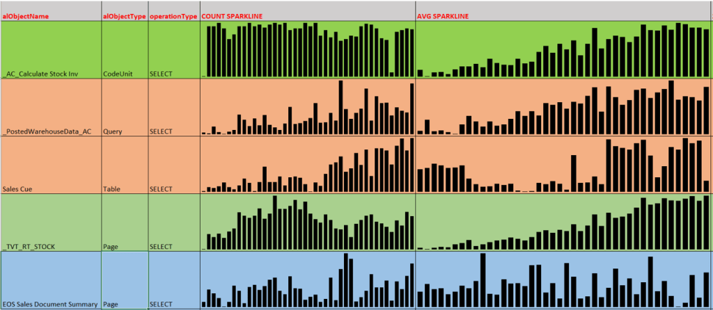
You could clearly see that line 1 and 4 are growing in average (of course, tables are getting fat day after day). Line 2 is trending high in both number and average. Line 3, Sales Cue, is also growing both in number and average but clearly spike up suddenly starting from one specific day. The last line is quite stable.
With such sparkline information you could act accordingly in refactoring code for better performance where it counts most, eliminating the noise.
Or just do nothing. And cry.
ANALYSIS MODE (AG GRID)
“This guy is crazy”, you might think now. No, I am not mad. Well, yes, I am but what I am writing is not insane.
Suprise, surprise! Also Azure Data Explorer implements “the best JavaScript grid in the world”: AG Grid.
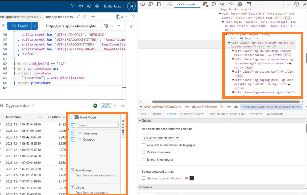
If you are working with Azure Data Explorer, you are also auto-training yourself in using the powerful Analysis Mode introduced with Dynamics 365 Business Central with 2023 Wave 1 (v22) and several of its features. Or, vice versa, if you are using Dynamics 365 Business Central Analysis Mode, you will also be proficient in no time applying it to Azure Data Explorer.
Two birds with a stone.
Let me show you one case where to apply it proficiently using pageViews.
You can find this simple KQL query in the same repo mentioned before: DT.Telemetry/PIVOT at main · duiliotacconi/DT.Telemetry (github.com)
The super-simple core is as follows (the rest are just base query params)
Take it and use it in Azure Data Explorer. Accommodate the timestamp range to what suites you best. Click on the small bookmark tab on the right (Columns) and toggle Pivot Mode. Drag and drop count_ into Values, timestamp into Column Labels, bucketIndex and name into Row Groups.
In less than a minute you have under your nose how your UI is performing every day, if there are regressions, the good ones, the bad ones (and the ugly ones too).
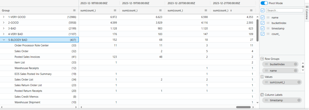
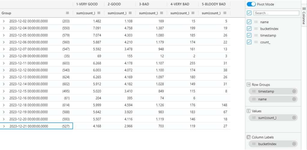
And if you play around simply swapping bucketindex with timestamp, you have a more compact view how the situation currently is and then drill-through if and where needed.
And that’s all folks.
PRIVATE TRACK – (you can skip reading this if you are only interested in the technical side of the blog post)
While having a blast with the family in a crowded mall (yes, we tried to pass through the Lego shop unharmed) I found out a small desk where a guy was customizing sneakers.
AH! There you go: the perfect Xmas gift for the caveman.


Leave a comment